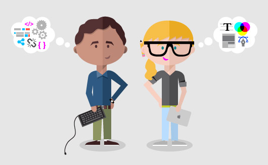
For the past, there has been a cold war happening between designers and developers. Designers have fumed about just how dependent they must be on developers to create mockups that go beyond limited static images. On the flip side, developers have resented their need for skilled designers to help them turn their own concepts into fully fledged, user-friendly interfaces.
But as design tools get better and easier to use, the cold war is coming to an end.
It’s possible now to create a fairly impressive interactive prototype of an app without any coding experience. This means that designers can test new apps without writing a single line of code. It also means that developers can use simple tools to work out their own professional-looking designs without others help.
Designers can obviously still benefit from learning to code, and developers should probably study design, but the gap between the two is getting easier and easier to bridge.
The main role of digital designers five to seven years ago was to design static images of pages and screens in Photoshop to then hand off to a wizard developer who would turn them into a functional website or app. The “mockup” was always a limited output. It was static, the data was fake, and there were zero interactions. Have you ever run a user test with a static image? It doesn’t go far.
Endless back and forth communication between designers and developers trying to understand the designer’s intent would create email chains long enough to wrap around the globe. Weeks of development would go by only to discover after launch that what the developer understood by “slide up” was very different from what the designer had in mind. It was hell.
In a world like this, it’s no wonder every developer wrote an article that designers should learn to code. The developer who received an un-annotated PSD with dozens of unlabeled layers would not be blamed for wanting to jump out of the nearest window.
At the same time, developers who were interested in designing their own apps were frustrated by the complexity of tools like Photoshop and Illustrator. They needed an entire graphic design education on top of their computer science learning in order to bring their own ideas to fruition. Developers who tried to cut corners and design for themselves on the fly ended up with under-designed, under-tested apps that floundered as soon as they hit the market.
Digital Design Doesn’t Stuck Anymore
Now, the situation between designers and developers is significantly better. With the invention of clever design tools and platforms like Craft by InVision, the InVision app, Framer, Flow, Flinto/Principle, and Sketch, designers and developers can easily design a prototype of an app and test it without the user even knowing that they’re using an app with no back-end.
The app will appear to work fully from the user’s perspective. Every single interaction, every flow will be there. The designer can gain valuable insights without touching a line of code, and the developer can create designs of their own with a few simple clicks.
Top six design tools:
This suite of apps lets designers pull in real data rather than the standard “Lorem ipsum” and Michael Jackson icon filler. The various apps work together to make the design process smoother and more automated. The apps support collaboration, mockup of prototypes, syncing, and most importantly, your own data.
InVision really changed the game by letting designers create mockups that are not static. With InVision’s simple tools, images can be transformed into clickable, interactive prototypes that feel like real apps. InVision supports collaboration, making it easier for fellow designers and users to comment on changes every step of the way.
Framer is kind of like InVision, but it has the ability to pull off more complex interactions. Some pretty major companies use Framer to help them design apps that are intuitive and useful, but also simple. Uber is a prime example. They have used Framer to design their Apple Watch app and UberPOOL.
Both of these apps can be used to create complex animations in minutes. They both take a bit of learning, but once designers become proficient with these apps, they can easily create animations that look and feel extremely professional, not like chintzy fillers.
Sketch is like Photoshop, but with about four times the features for web and app developers. This powerful tool solves the problem of static designs that do nothing by letting designers create icons, interfaces, and websites that are totally unique and handcrafted.
This one feels like a Mike Tyson uppercut. Webflow basically eliminates the need for designers to write any front-end code. Now designers use this beautiful WYSIWYG editor to do all the heavy lifting.


